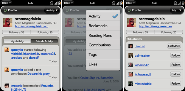
- a complete redesign of the entire interface of the app
- a brand new dashboard for quick navigation of key areas
- dozens of small enhancements that make a big difference
Complete Redesign
Two months ago, we went back to the drawing board with the Android Bible app design to make reading the Bible an even more pleasing experience on your Android device. We thought through every element, menu item, and button to make sure you you could get around in the app easily and focus on Scripture.
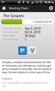
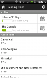
The redesign is too extensive to detail here, so take a peek at a couple screenshots and download the 2.2 release to experience the real thing. The biggest enhancements can be found in the Bible reader and reading plans.
New Dashboard
When we released the Palm webOS Bible app, we saw the benefit for our users to have a dashboard to act as a central hub for the main components of the app. The Android Bible app’s dashboard now includes a news section where you’ll find announcements about YouVersion, warnings about scheduled server maintenance, ways to connect with the YouVersion team on Twitter and Facebook, and a few splashes of color for your visual enjoyment.
Lots of Small Tweaks
We love to enhance the little things that make your experience the best it can be. Our team made over 70 changes to the Android Bible app for this release (some seen and some unseen) including tweaks that will improve the speed of the app, better communication with the user, and small design adjustments. Here are a few samples:
- double-tap the header to scroll to the top
- progress bars in the reading plans list for plans you’ve started
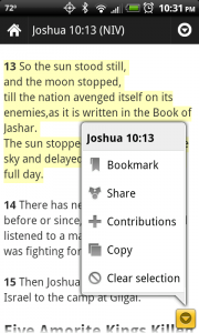
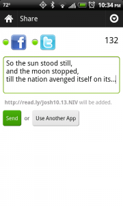
- sharing multiple verses at one time
- your bookmarks sync automatically with YouVersion.com
- donate to YouVersion inside the app
- more helpful error messages when something goes wrong
- lots of little bug fixes
We know you’ll enjoy the changes in release 2.2 of the Android Bible app, so download it now and engage with Scripture like never before.

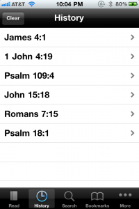 The new History feature is cool. It’ll help you navigate more quickly to verses you were reading recently. It’s great for when you want to share a verse with a friend, but can’t remember where it was. Or use it to keep up with your pastor when he’s jumping back-and-forth between two or more verses during a sermon.
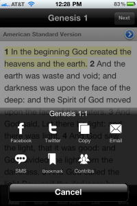 Copy Bible Verses