…happy is the man… [whose] delight is in the Lord’s instruction, and he meditates on it day and night.
Psalm 1:1–2 (HCSB)
Delight yourself in the Lord…
We hope you’ve been enjoying the recent redesign of the all-new Bible App for your iPhone, iPad, or iPod. Today we’re introducing a small update to that redesign: three brand-new features, each one crafted to bring you the best, most engaging Bible reading experience we’ve ever offered on Apple devices. (If you haven’t already been using this beautiful new Bible App, there’s never been a better time for you to update!)
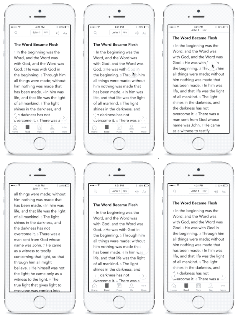
Focus more on His Word.

To show you more of the Bible text, now the Bible App’s menus slip out of your way as you begin scrolling. (To see them again, simply scroll up slightly or double-tap.) And, when you reach the end of a chapter, the navigation buttons conveniently reappear.
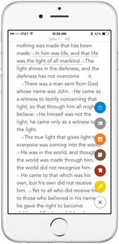
Take action on what inspires you.

Now when you tap a verse or passage, elegant verse action buttons pop up, showing you all of your options — each action available with a single tap: Highlight, Bookmark, Note, Verse Image, Share, and Related*.
*Related shows your previous Bookmarks, Highlights, Notes, and Verse Images for the selected passage, along with what other people are saying about it in Public Notes.
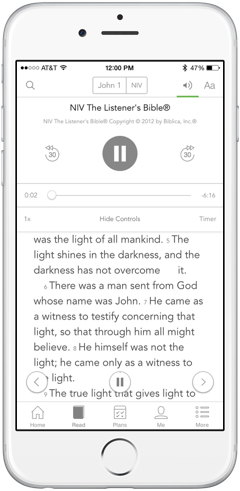
Choose where you control audio.

When you select a Bible version that features audio on your iPhone or iPod, a play/pause button appears at the bottom, “floating” above the Bible text, so you can begin listening with just one tap. But, if you’d rather use the more traditional play button in the top section, you can tap “Hide Controls” to make the floating button go away. (Just tap “Show Controls” to bring it back.)
![]() The new Bible App for Android will include all three of these features when it releases in the coming weeks.
The new Bible App for Android will include all three of these features when it releases in the coming weeks.
This post is also available in: German Spanish French Dutch Portuguese Russian Chinese (Simplified) Chinese (Traditional) Korean
